Ever wondered how a piece of fruit with a bite mark out of it become one of the world’s most famous logos? How it can compete with logos which are hundreds of years old, while only being only 39 years old? Whether you love it or hate it, everyone seems to know and have an opinion over the famous fruit.
One conservative commentator linked Apple’s logo to Alan Turning. Turning was a mathematician who broke the Nazi Enigma code, formed the basis for modern computing and committed suicide after being prosecuted for being gay. This commentator thought Apple’s logo gave a salute to Turning who committed suicide through eating a cyanide infused apple!
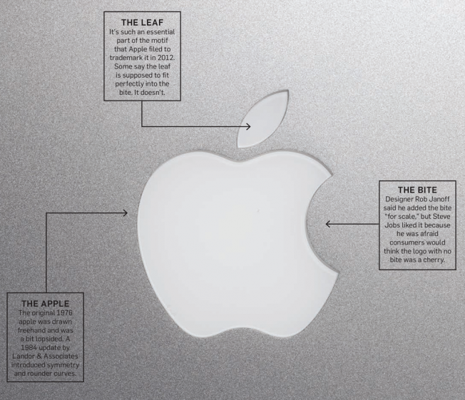
For those who think that theory is a bit of a stretch, there are other alternative views on the Apple logo. This inforgraphic from Adweek describes it pretty well:

Apple’s famous apple is not a conspiracy ridden logo with hidden meanings and secret political agendas. Rather it is a clear and intuitively simplistic design that reflects Apple’s sleek products well. Although unlike Apple’s products, the logo itself won’t bend after sitting in your back pocket! The logo has evolved over time while still holding a classic design.
The famous apple grew when Steve Jobs decided the original woodcut logo was too complex to be memorable. He gave designer Rob Janoff a straightforward brief: “Don’t make it cute.” Janoff decided that for a company named Apple, the only feasible option would be an apple. He said, “”It was a no-brainer. You would miss the mark if you didn’t show some kind of apple.”
